How to Build a SaaS Dashboard Users Actually Understand
A practical guide to designing and building a SaaS dashboard that users read in five seconds, not five minutes, from metrics to the tech stack.
 SprintX Team8 min read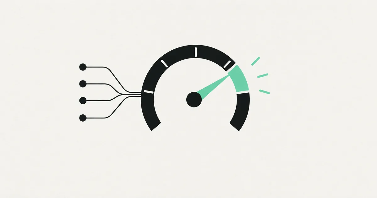
Here is an uncomfortable truth about SaaS dashboards: most users glance at yours for about five seconds and then leave. If they can't tell whether things are good or bad in that window, the dashboard has failed — no matter how many charts it has. A dashboard is not a place to show everything you can measure. It is a place to answer one question fast: "Am I okay, and what do I do next?"
This guide covers how to build a SaaS dashboard people actually understand: what to put on it, how to lay it out, which charts to use, the tools that get you there, and the mistakes that quietly kill engagement.
Start with the question, not the data
The worst dashboards are built data-first: someone lists every metric the database can produce and crams them onto a screen. The result is a wall of numbers that means nothing.
Instead, start with the job your user is trying to do. For each type of user, answer:
- What decision are they making with this screen?
- What "good" looks like — the number that tells them they're winning.
- What they do next if it's bad.
A marketing user opening an analytics tool wants to know if this week beat last week and where to focus. An ops user wants to know what's broken right now. Those are different dashboards, even in the same product. Name the decision first, and the layout designs itself.
The inverted-pyramid layout
Good dashboards mirror how a newspaper front page works: the most important thing is biggest and at the top, detail lives below.
- Top row — headline KPIs. Three to five numbers that summarize health, each with a comparison ("↑ 12% vs last week"). A number with no context is useless.
- Middle — trends. A chart or two showing how the headline metrics are moving over time.
- Bottom — detail and tables. The granular rows people drill into only when something looks off.
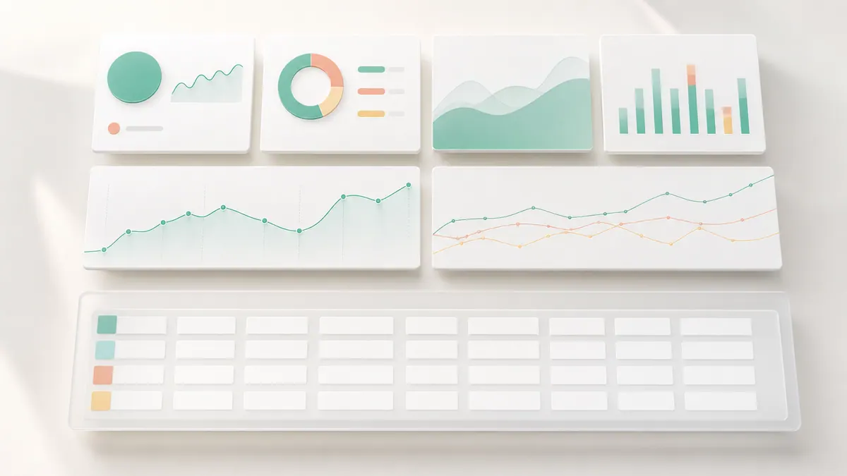
This ordering does the thinking for the user. They read top to bottom and go from "how am I doing" to "why" to "which rows" without hunting.
Choose the right chart for the job
Chart choice is where dashboards go from clear to confusing. A quick reference:
| You want to show | Use | Avoid |
|---|---|---|
| A single current value | Big number / KPI card | A gauge |
| Change over time | Line or area chart | Pie chart |
| Comparison between categories | Bar chart | 3D anything |
| Parts of a whole | Stacked bar or a simple % | Pie with 8 slices |
| Progress to a goal | Progress bar | Speedometer |
The rule: fewer, clearer visuals beat more, prettier ones. If a number in a box does the job, use the number. Every chart you add is something the user has to decode.
Keep it fast, or it won't get used
A dashboard that takes six seconds to load gets abandoned. Two performance habits matter most:
- Aggregate on the server, not the browser. Don't ship 100,000 rows to the client and sum them in JavaScript. Pre-compute totals in the database or a materialized view.
- Load progressively. Show the headline KPIs instantly, then fill in heavier charts. Users forgive a chart that takes a moment far more than a blank screen.
For anything above a few thousand records, cache the expensive queries and refresh them on a schedule. Nobody needs their revenue chart recalculated on every page load.
The stack that gets you there
You don't need to invent this from scratch. A modern, boring, reliable stack:
- Next.js and React for the app shell and routing.
- A charting library — Recharts or Tremor for standard dashboards, visx or D3 when you need something custom.
- Supabase or Postgres for data, with aggregated views for speed.
- A component system — shadcn/ui or similar so KPI cards, tables, and filters stay consistent.
- Vercel for hosting and fast global delivery.
Consistency is underrated here. When every KPI card, date filter, and table behaves the same way, the whole product feels trustworthy. That polish is part of why teams bring in a partner to build the SaaS product properly rather than stitching together mismatched pieces.
Real-time or periodic? Match refresh to the decision
A surprising amount of dashboard complexity comes from teams building live-updating charts nobody needs. Real-time sounds impressive, but it's expensive to build and often distracting to use. Match the refresh rate to how the number is actually used:
- Real-time (websockets, live subscriptions) only for genuinely operational screens — a support queue, an active-calls monitor, a live ops board where seconds matter.
- Periodic (refresh on load, or every few minutes) for almost everything else. Revenue, signups, and weekly trends do not need to tick up live, and pretending they do just burns engineering time and database load.
When in doubt, ship periodic. You can always add live updates to the one widget that truly needs it later. Building everything real-time up front is a classic way to blow a budget on polish users never asked for.
Design the empty and loading states first
New users don't arrive to a full dashboard — they arrive to nothing. The day-one experience is a blank screen, and if it looks broken, they churn before they ever see the value. Treat empty states as a real design job:
- Explain what will appear here and how to make it happen ("Connect your account to see revenue").
- Offer a clear first action, not a shrug.
- Use skeleton loaders, not spinners, so the layout feels stable while data arrives.
The same discipline applies to error states. A chart that fails to load should say so gracefully, not leave a confusing gap. These edges are exactly where cheap dashboards feel cheap.
Common mistakes that kill dashboards
- Vanity metrics. Total signups ever feels good and tells you nothing. Show active users and trend.
- No comparison. "1,240 visits" — is that good? Always pair a number with a benchmark or delta.
- Everything at once. If it all screams for attention, nothing gets it. Use size and position to set priority.
- No empty states. New users see a blank dashboard on day one. Design that first-run screen deliberately — it's their first impression.
- Ignoring mobile. Founders check numbers on their phone. At least the headline KPIs must work small.
Frequently asked questions
How many metrics should a dashboard show? On the main view, three to five headline KPIs plus one or two trend charts. Push everything else to detail pages. Density is the enemy of comprehension.
Should I build a custom dashboard or use an embedded tool? Embedded analytics (like Metabase or a BI tool) is fine for internal reporting. For a dashboard that's part of your product's core experience, custom is worth it — it matches your brand, your data model, and your users' actual decisions.
Which charts should I avoid? Pie charts with many slices, gauges, and anything 3D. They look fancy and read poorly. A bar chart or a plain number almost always communicates better.
How do I keep a dashboard fast with lots of data? Aggregate in the database, cache expensive queries, and load the page progressively — headline numbers first, heavy charts second.
Building a SaaS product and want a dashboard users actually read instead of tolerate? SprintX designs and builds SaaS dashboards — the right metrics, clean layouts, and a fast stack — on a fixed-scope quote you own, no lock-in. Show us your product and we'll help make the numbers make sense.
Building software
Systems your business runs on.
Custom platforms, internal tools and integrations that move work off spreadsheets.
Keep reading.
More on building software
Building software · 11 Jul 2026 · 9 min read
How to Build a SaaS MVP in 8 Weeks
A week-by-week playbook for building a SaaS MVP in eight weeks — scope, stack, and the discipline that keeps a first version shippable.
Building software · 11 Jul 2026 · 9 min read
Adding Stripe Subscriptions to Your SaaS: A Complete Guide
How to add Stripe subscription billing to a SaaS the right way — checkout, webhooks, the customer portal, and the details that keep revenue accurate.
Building software · 11 Jul 2026 · 9 min read
How to Build a Multi-Tenant SaaS the Right Way
A founder-and-engineer guide to multi-tenant SaaS architecture: how to isolate tenant data, pick a tenancy model, and avoid the leaks that sink products.